Insights
Course sales conversion rate: how to calculate it and what it really means
Most course creators track their course sales conversion rate the wrong way, and the mistake costs them more than they realize. They pull a single percentage from their analytics dashboard, compare it to a benchmark they found in a blog post, and walk away either relieved or frustrated without understanding what the number actually tells them.
The truth is that conversion rate is not one metric. It is a family of metrics, and which denominator you choose changes everything about what you are measuring and what you should do next.
In this tutorial, you will learn exactly how to calculate your course sales conversion rate at each stage of the enrollment journey, why a sitewide average masks the specific points where performance is breaking down, and what the evidence actually supports when it comes to benchmarks. You will also work through real examples showing how the same business can produce wildly different conversion figures depending on how the calculation is framed. By the end, you will have a precise, stage-by-stage framework that replaces vague percentages with actionable diagnostic data.
What a course sales conversion rate actually measures

Your course sales conversion rate is calculated using a single formula:
Conversion Rate = (Number of Desired Actions ÷ Number of People Who Had the Opportunity to Take That Action) × 100
The arithmetic is straightforward. What makes the result meaningful, or misleading, is the number you put in the denominator.
This is the central problem with how most course and training businesses measure conversion performance. Website visitors, landing page visitors, opted-in leads, applicants, and checkout starters are not interchangeable denominators. Each describes a different population. Each produces a different conversion rate from identical sales data. Treating them as equivalent is the most common measurement mistake in course businesses, and it is the reason so many teams either misread their own performance or compare themselves to benchmarks that were calculated on a completely different basis.
A concrete example makes this precise. Consider a business that generated six course purchases in a given month. Measured against 5,000 total website visitors, the conversion rate is 0.12%. Measured against 800 sales page visitors, the same six purchases produce a rate of 0.75%. Measured against 240 opted-in email leads, the rate becomes 2.5%. None of these numbers is wrong. All three describe the same six sales. They simply answer different questions about where in the journey those sales came from.
This matters most when you are trying to use a benchmark. If a published figure suggests a 2% conversion rate is typical for a program like yours, but you do not know whether that figure was calculated from sales page visitors, total site traffic, or an email list, you cannot determine whether your own number sits above or below it. The benchmark is uninterpretable without denominator transparency, and most published figures do not disclose this clearly. For a broader grounding in what online course conversion rates measure and how they are typically reported, that context is worth establishing before working through your own numbers.
The sections that follow work through this problem stage by stage. A course sales or enrollment journey moves through several distinct phases, from first site visit through to confirmed enrollment, and each phase has its own appropriate denominator, its own diagnostic question, and its own reference data where that data exists. Those stages are: traffic arriving at your site, landing page or sales page visits, lead or opt-in capture, sales page to purchase, and checkout completion through to confirmed enrollment.
Each stage produces a conversion rate. Each rate measures something different. The goal of this article is to show you how to calculate each one correctly and what the result tells you about where your enrollment performance is, and is not, working.
The five denominators that define your conversion rate
Each of these five denominators answers a distinct question. Mixing them, or benchmarking one against data calculated from another, is where most conversion rate analysis goes wrong.
1. Total website visitors
Formula: Purchases ÷ Total Site Visitors × 100
This measures sitewide conversion efficiency across every page on your domain. It is useful for tracking broad trends over time, but it aggregates pages with completely different purposes: a blog post about certification trends, your about page, and your checkout page all contribute to the denominator. Because most site visitors will never see a sales page, this will always produce your lowest-looking conversion number. A change in the ratio of content traffic to transactional traffic will move this figure even if your sales page performance is unchanged.
2. Landing page or sales page visitors
Formula: Purchases ÷ Sales Page Visitors × 100
This measures the effectiveness of a specific page or offer. It is the denominator used in most published course conversion benchmarks, which is precisely why it is also the most commonly misapplied figure. When a source quotes a conversion rate for online courses, it almost always means this calculation, not a sitewide rate. Applying that benchmark to your sitewide number will make your business look worse than it is.
3. Leads or opted-in contacts
Formula: Purchases ÷ Total Leads × 100
This measures lead-to-sale conversion and reflects the quality of your nurture sequence or email marketing. Email list audiences convert at materially higher rates than cold traffic, which is why this figure is not comparable to any traffic-based rate. A 10% lead-to-sale rate is not a "better conversion rate" than a 2% sales page rate; they are measuring completely different populations at completely different stages of consideration.
4. Applicants
Formula: Enrolments ÷ Applications × 100
This denominator applies to high-ticket, selective, or cohort-based programs where an application precedes enrolment. It reflects both offer fit and selection criteria, not just page or messaging performance. A 40% application-to-enrolment rate tells you something about how well your intake process filters and converts qualified candidates; it says very little about your marketing effectiveness upstream.
5. Checkout starters
Formula: Completed Purchases ÷ Checkout Sessions Started × 100
This measures post-intent friction and is one of the most underdiagnosed stages in a course sales journey. A prospective student who initiates checkout has already decided to buy in principle. Figures cited in the literature suggest average checkout completion for course businesses sits around 55 to 65%, with top performers reaching 75 to 85%. That gap means up to 45 cents in every dollar of demonstrated purchase intent is lost before the transaction completes, often due to payment friction, form complexity, or unexpected pricing rather than any problem with the offer itself.
None of these denominators is more correct than the others. Each answers a different question, and the right choice depends entirely on what you are trying to diagnose. If you want to work through each stage using your own data, your questions about course and enrollment conversion benchmarks, answered.
Worked examples: the same business, very different numbers
Those five denominators are not just a theoretical exercise. Put them to work on real numbers and the practical stakes become clear.
Example a: low-ticket self-study course (under $500)
A course priced at $297 receives 4,000 sales page visits in a month. One hundred and twenty people purchase.
Sales Page Conversion Rate = (120 ÷ 4,000) × 100 = 3.0%
Figures cited in the literature suggest the average range for courses at this price tier is 3–5%, with top performers reaching 8–12%. A result of 3.0% sits at the lower end of the average band. That is worth monitoring, but it is not a signal of a broken page or a failing offer. Context saves a number that might otherwise trigger unnecessary intervention.
Example B: high-ticket professional certification (over $2,000)
The same measurement applied to a high-ticket professional certification program: a sales page receiving 800 visitors in a month, with 6 purchases.
Sales Page Conversion Rate = (6 ÷ 800) × 100 = 0.75%
At first glance, 0.75% looks alarming. One commonly referenced range places average performance for programs at this price point at 0.1–0.5%, with top performers at 0.5–2%. That means 0.75% is actually in the upper portion of what is typically reported for this tier. The number is not small because the marketing is underperforming; it is small because higher-priced programs require longer consideration cycles, more social proof, and deeper buyer conviction. Price tier has a structural effect on conversion rate that is entirely independent of marketing quality. Judging a high-ticket program against a sub-$500 benchmark is a category error.
Example C: one business, three conversion rates
Now take those 6 purchases from Example B and measure them three different ways, using the same time period.
Denominator | Calculation | Conversion Rate |
|---|---|---|
Total site visitors (5,000) | 6 ÷ 5,000 × 100 | 0.12% |
Sales page visitors (800) | 6 ÷ 800 × 100 | 0.75% |
Opted-in email leads (240) | 6 ÷ 240 × 100 | 2.50% |
All three numbers describe identical commercial performance: six enrolments. None is wrong. Each answers a different question about a different part of the journey, as discussed in what you are actually asking someone to do at each stage.
This is why denominator transparency matters when reading external data. If a source quotes a 2–3% EdTech sector conversion rate without specifying the denominator, there is no way to know whether that figure represents a sitewide rate, a sales page rate, or a lead-to-sale rate. Applied to the wrong measurement, it will either flatter or condemn performance that is actually ordinary.
A stage-by-stage view of the course enrollment journey
As the examples above show, the same sales figure produces three different conversion rates depending on the denominator, and that problem compounds across an entire enrollment journey. The table below maps the five key stages from first visit to confirmed enrollment.
Journey Stage | What It Measures | Directional Range | Notes |
|---|---|---|---|
Traffic to landing page visit | Traffic quality and relevance | Varies widely by channel | A click-through signal, not a conversion rate in the strict sense |
Landing page visit to opt-in or lead | Lead capture effectiveness | Varies by traffic source and audience temperature | Source type dominates this number more than page design |
Lead to sales page visit | Nurture and email sequence effectiveness | No reliable published benchmark | Internal trend data is more useful than any external range |
Sales page visit to purchase | Sales page conversion | Varies significantly by price tier | The most-cited stage; the most frequently misread denominator |
Purchase to checkout completion | Post-intent friction | 55-65% average; 75-85% top performers | Frequently overlooked; one of the highest-leverage stages |
Stage 1: Traffic to landing page visit is better understood as a traffic quality and relevance signal than a conversion metric. The figure shifts dramatically by channel: branded search, cold paid social, and organic content traffic behave entirely differently. Because the denominator and audience composition are incomparable across channels, there is no meaningful cross-business benchmark here.
Stage 2: Landing page visit to opt-in or lead is where lead capture effectiveness shows up. The important diagnostic point is that source type drives this number more than page design does. Improving copy on a cold-traffic opt-in page will move the needle less than improving the quality or intent-match of the traffic itself. For a deeper look at how traffic source affects each stage, online course conversion rate: what actually drives enrollment? covers the demand-side dynamics in detail.
Stage 3: Lead to sales page visit reflects how well your nurture sequence, email flow, or follow-up process moves a lead toward the point of consideration. Reliable published benchmarks for this specific stage are genuinely limited. Most published data conflates email open rates with actual page visits, which makes cross-study comparison meaningless. The honest position is that your own internal trend data is more useful here than any external range.
Stage 4: Sales page visit to purchase is the stage most people mean when they say "course conversion rate," and the one most often quoted without a denominator attached. Conversion rates at this stage vary significantly by price tier: a lower-priced self-study course and a high-ticket professional certification are simply not comparable on this metric.
Stage 5: Purchase to checkout completion is the most frequently overlooked stage in an enrollment journey. A prospective student who clicks "buy" has demonstrated clear intent, but checkout abandonment eliminates a significant share of those buyers before payment is confirmed. As noted in the denominators section above, average completion sits around 55–65%, with top performers reaching 75–85%, making checkout friction one of the highest-leverage targets in the entire funnel. When reviewing where enrollment performance has shifted, checking this stage first is often where the fastest improvements are found.
One important caveat applies to the entire table: reliable benchmark evidence does not exist for every stage. Where data is absent or the methodological basis of a cited range is opaque, the figures above should be treated as directional orientation only, not as precise performance standards.
Why a single sitewide rate hides where performance is changing
The stage-by-stage table above shows what you need to measure. This section explains why measuring it that way is not optional if you want to understand what is actually happening.
When traffic to any one page or stage changes, the headline sitewide rate moves, even if nothing about your sales page, your offer, or your checkout has changed at all. This is not a theoretical concern. It is the mechanism behind a large share of the "my conversion rate dropped" conversations that turn out, on closer inspection, to have nothing to do with conversion performance at the point of sale.
The scenario that sitewide rates cannot diagnose
Consider a business that runs a content campaign in Q3, driving meaningful new blog traffic. Sales in the following quarter decline noticeably. The sitewide conversion rate has fallen. The obvious read is that something broke in the conversion process.
But when each stage is measured separately, the sales page conversion rate is unchanged. Checkout completion is unchanged. The problem is in lead-to-sales-page progression: fewer leads are clicking through from the email nurture sequence to the sales page. The nurture sequence had degraded, not the offer. The sitewide rate mixed that signal into everything else and made it invisible.
As shown in the stage-by-stage section above, the corrective action differs entirely depending on which stage has shifted, and a sitewide number does not distinguish between them.
Four causes, one number
A decline in a sitewide conversion rate is consistent with at least four distinct situations:
The sales page stopped converting
A new content campaign brought in high volumes of non-purchasing traffic
Checkout abandonment increased after a payment or UX change
The email nurture sequence broke and fewer leads reached the sales page
Each of these requires a different response. The sitewide number cannot tell you which one you are dealing with, because it compresses all four possibilities into a single figure.
Stage-level measurement resolves this. When each rate is tracked independently, a change in one stage produces a visible change in that stage's metric. The signal is not diluted across the whole funnel; it surfaces exactly where the problem is.
This is the question at the centre of enrollment performance work: not whether the headline rate changed, but where in the journey between marketing and enrollment the change occurred, and why. For businesses investigating a meaningful shift in course sales, the key takeaways in this article on diagnosing declining enrollment cover this diagnostic framing in more depth. A single sitewide rate is structurally unable to answer that question.
On benchmarks: what the evidence actually supports
Stage-by-stage measurement tells you where performance has changed. The harder question is: compared to what?
The honest answer is that the benchmark landscape for course sales conversion rates is uneven. Sales-page-to-purchase figures by price tier are the most widely cited numbers in the online course literature, but the methodological basis behind them is rarely disclosed. You will find ranges cited for sub-$500 courses and for programs priced above $2,000, but few sources explain how those figures were collected, from which businesses, or which denominator was used. Treat them as directional orientation. As the worked examples earlier show, those two calculations on the same business can differ by a factor of six, so confirming which denominator a source used before applying its figures to your own data is essential.
Sector-level EdTech benchmarks, often cited around 2–3%, have even more limited diagnostic value. As the worked examples earlier illustrate, a sector average blends businesses with very different price points, consideration cycles, and program structures into a single figure that tells you almost nothing useful about whether a specific program at a specific price point is performing well or poorly. For a more grounded view of what the available evidence actually covers, our enrollment and conversion benchmarks research works through what the data supports and where the gaps are.
Your own historical performance is the most useful benchmark you have. A consistent shift in your own conversion rate, measured against the same denominator across comparable periods, is a real and actionable signal. No sector average offers that precision.
External benchmarks are worth consulting in two specific situations: when you have no internal baseline yet and need a rough sanity check, or when you suspect a particular stage, such as checkout completion, may be structurally below what is achievable. In both cases, verify that the source used a comparable denominator and describes a business type similar to your own. If it does not, the comparison adds noise rather than clarity.
How to calculate your course sales conversion rate
With a clear benchmark framework in place, the next step is applying it to your own numbers. The calculation itself is straightforward; what takes discipline is the preparation that makes the result mean something.
Step 1: define the conversion action at each stage
Before opening your analytics platform, write down what counts as a conversion at each stage you are measuring. A "lead" might mean a form submission, a webinar registration, or an email opt-in, and those are not the same population. A "sale" might mean a checkout completion, a payment confirmed, or an enrolment activated in your course platform, and those can diverge if payment failures are common.
Define each action once, document it, and keep the definition fixed across measurement periods. Changing the definition mid-measurement distorts your trend line just as surely as changing the denominator does.
Step 2: define the denominator for each stage
For each stage, identify which population had the opportunity to take the action you defined in Step 1. Sales page visitors had the opportunity to purchase; opted-in leads had the opportunity to click through to the sales page; checkout starters had the opportunity to complete payment.
This is the decision that determines whether your conversion rate is diagnostic or decorative. If your denominator is too broad (total site visitors for a sales page rate), the number will look artificially low and will not move when your sales page improves. If it is too narrow (only returning visitors), it will look artificially high and will not reflect the full scope of the problem.
Step 3: pull aligned numbers from your data sources
Retrieve your numerator and denominator counts from your analytics platform, CRM, or course platform, and confirm that the time periods match. For stages with short cycles, a calendar month is usually sufficient. For higher-ticket programs where leads may take two or three months to convert, using a monthly cohort of leads against the same month's purchases will undercount conversions. Extend the attribution window to match your typical consideration cycle, or use cohort-based tracking where your platform supports it.
Step 4: calculate stage by stage, not end-to-end
Apply the formula at each stage separately:
Conversion Rate = (Conversions at this stage ÷ Population who had the opportunity) × 100
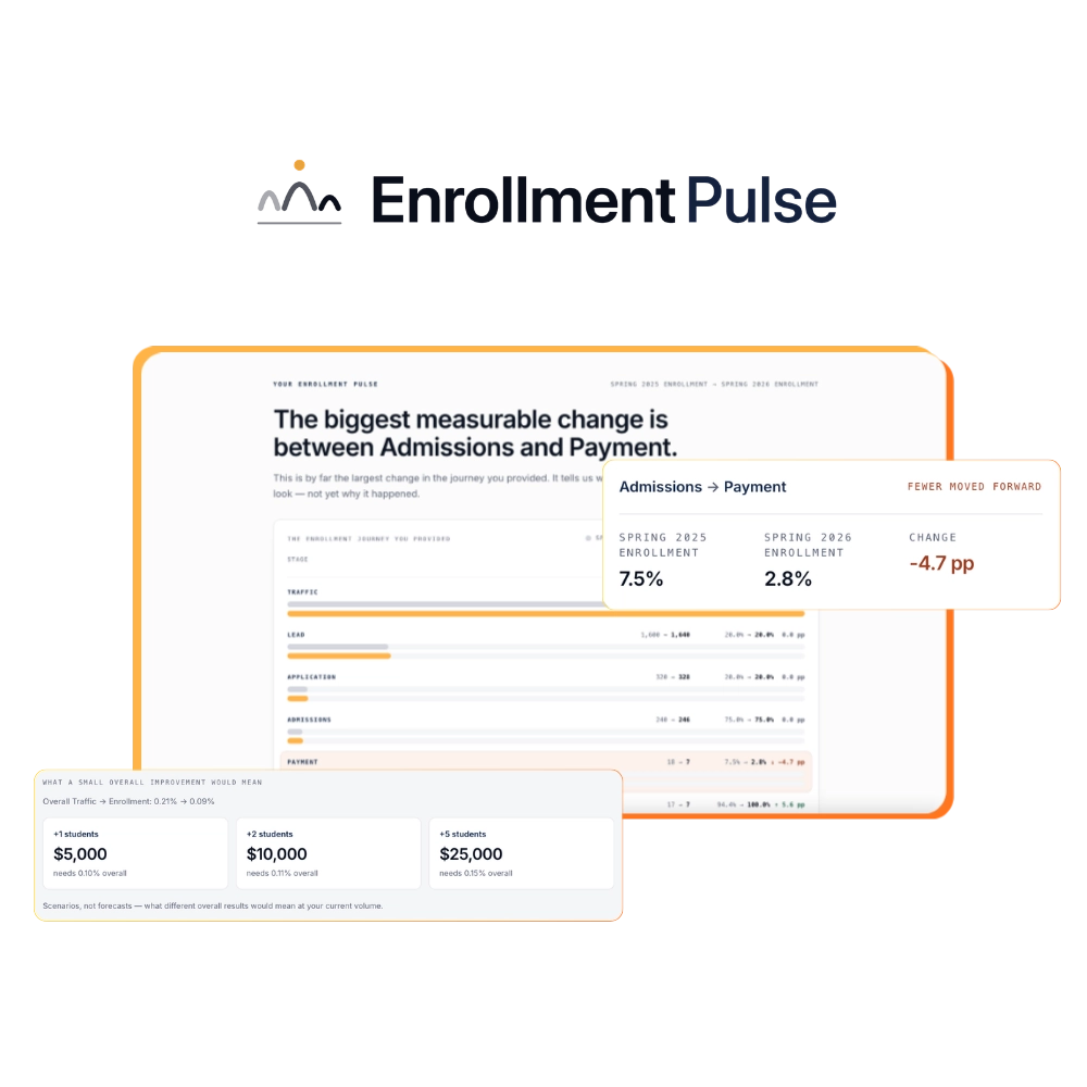
A single traffic-to-sale rate compresses every stage into one number and strips out the diagnostic information. Stage-by-stage rates show you which part of the journey is performing and which is not. A drop in overall sales is only useful information once you know whether it originates at the lead capture stage, the nurture stage, the sales page, or checkout.
If you want to work through your own numbers across each stage without building a spreadsheet from scratch, our course conversion rate diagnostic tool walks through each stage in sequence and flags where your rates sit relative to available reference ranges.
Key takeaways
Once you have worked through your calculations stage by stage, three principles should stay with you as you interpret what you find.
The formula is not the problem; the denominator is. As shown throughout the worked examples above, sitewide visitors, sales page visitors, opted-in leads, and applicants all produce different numbers from identical sales data. Denominator selection determines whether your measurement answers the question you are actually asking.
A single headline rate hides where performance is moving. As the stage-by-stage section demonstrates, only stage-by-stage measurement isolates which part of the enrollment journey moved and in which direction. The headline number is a flag; the stage rates are the diagnosis.
Your own trend line outperforms any external benchmark. As the benchmarks section sets out, external ranges offer broad orientation when you have no internal baseline, but a consistent shift in your own numbers, measured against the same denominator, is more actionable than any comparison to an industry average.
For businesses dealing with a more significant or sustained change in enrollment performance, that is precisely the territory Heroes and Guides works in. The enrollment diagnostic work we do with education and training businesses is designed to identify where in the journey between marketing and enrollment performance has shifted, and why.
About the author

Hanna-Mari Kirs
Founder & Strategist, Heroes & Guides
Hanna-Mari is an enrollment strategist researching how online educators, certification providers and course creators can improve student enrollment conversion through clearer enrollment journeys, decision-making psychology and website strategy.